

Global Standards
Our philosophy is to establish convergence of various methodologies and standards
- Project Management Services
- Strategy Map and Balanced Scorecard
- Business Process Modeling – BPMN
- Enterprise Architecture – TOGAF, Zachman, DoDAF
- Project Management– PMI®
- Program and Portfolio Management – PMI®
- Software Project Management – Agile
- Business Analysis – IIBA®
- Requirement Analysis & Design – UML
{module 83}
Stock Photography
- Details
- Created: 30 June 2012
Contact Us
- Details
- Created: 11 June 2012
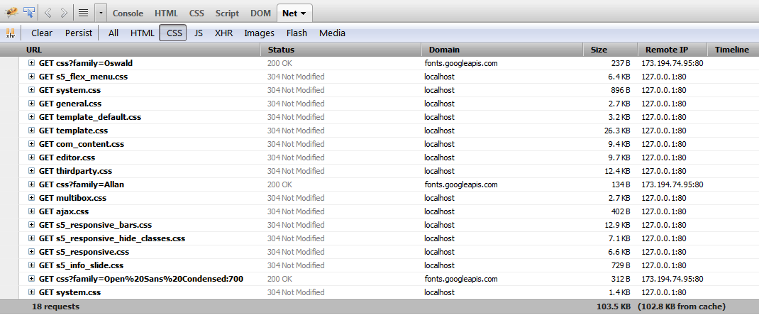
Increase speed and performance by compressing core template CSS and Javascript files to much smaller sizes than the original! Enabling compression is a great way to boost your site's performance. It simply combines css and js into consolidated files. This reduces the downloads sizes and reduces the numbers of calls to your server, to dramatically help your site's overall performance. No data is lost during this process, just simply made smaller. Please note that this compression will only compress core template files, not third party files or files from extensions.

Gzip must be installed on your server and enabled in PHP in order to function.
See It In Action!
Without Compression Enabled:

With Compression nabled:

Hide Divs, Content, and Modules
- Details
- Created: 11 June 2012
Hide Sections of the Template via the Template Configuration
This is the simplest way to hide an area of the template is to use the template interface to easily select areas of the template that you want to hide on tablet sized screens (970px and less) or mobile screens (580px or less). Simply select the area that you want to hide and the Vertex framework takes care of the rest! These fields do work independent of each other, so if you want to hide something on both tablet and mobile sized screens you must select the same area on both fields.
IMPORTANT - If you turn off a column position such as right or right_inset something else must be in the same column or the layout will not work. For example you can turn off right_inset and keep right, but you cannot turn off both unless something is publihsed to right_top or right_bottom as well.
Hide Specific Modules via the Hide Classes
If you have only a specific module that you would like to hide at certain screen sizes, and not an entire section of the template, this is the best approach. A hide class is a class that can be applied to any element on the page and hides that particular element at certain screen sizes. Classes range in 100px increments for large screens and 50px increments for small screens. Below are some examples, and at the very bottom of this page there is a list of all the available hide classes. Use these sparingly if you can. As a recommendation, the primary target of these classes should focus on tablet and mobile sized screens. Wide screen monitors vary in size so it's much harder to use these classes correctly for large monitors. Tablet and mobile devices are much more consistent in size so it is much easier to apply the smaller hide classes.For example, say you want to hide a specific module when the screen sizes reaches 900px wide, and remain hidden for any screen below 900px. Simply add class=hide_900 to the title of the module like this:

The class is simply put into the title of the module. There must be a space just before class= , and don't worry, the class area of the title won't actually show on the live site, it's only shown in the backend. It must be entered exactly as shown above. The title can be published or unpublished, it does not matter which. Simply adding the classes to the title will apply the classes to the entire module.
What if you want it to hide the module only for a certain range? That's easy just add _only to the end of the class name. hide_900_only will only hide that element from 900px to the next increment in the hide classes, which is 850px. So it will only be hidden from 850px to 900px. You can also add multiple classes to the title like this class=hide_900_only hide_850_only which will apply both classes to the module.
What if you want to hide the module and then show it again later? That's simple, use show_ in the class instead of hide_. This will make the module show for the specified size no matter what other settings are on the module. So if you want to hide the module from 1000px and below, but you want to show it again later then do something like the following class=hide_1000 show_600. This will hide the module from 600px to 1000px.
Is there a more simple way? Yes, of course, the above directions are for experienced users who want to tweak their content for every available screen size. If you don't want to mess around with specific window sizes simply use the following classes instead, which have preset screen sizes applied to them:
hide_wide_screen
hide_standard_screen
hide_large_tablet
hide_small_tablet
hide_mobile
show_wide_screen
show_standard_screen
show_large_tablet
show_small_tablet
show_mobile
Hide Specific Content via the Hide Classes
If you have only specific content or images within an article or module that you want to hide then use the same hide classes described above, but wrap that specific content inside of the class instead of applying it to the entire module. For example, in the image below, the third paragraph will hide at 900px and then show again at 700px.
Available Hide Classes
All the available hide classes are listed below. Note there is a break at 970px and 580px to accommodate tablet and mobile sized screens.@media screen and (max-width: 1600px){
.hide_1600 {
display:none;
}
}
@media screen and (min-width:1500px) and (max-width: 1600px){
.hide_1600_only {
display:none;
}
}
@media screen and (max-width: 1600px){
.show_1600 {
display:inline;
}
}
@media screen and (min-width:1500px) and (max-width: 1600px){
.show_1600_only {
display:inline;
}
}
@media screen and (max-width: 1500px){
.hide_1500 {
display:none;
}
}
@media screen and (min-width:1400px) and (max-width: 1500px){
.hide_1500_only {
display:none;
}
}
@media screen and (max-width: 1500px){
.show_1500 {
display:inline;
}
}
@media screen and (min-width:1400px) and (max-width: 1500px){
.show_1500_only {
display:inline;
}
}
@media screen and (max-width: 1400px){
.hide_1400 {
display:none;
}
}
@media screen and (min-width:1300px) and (max-width: 1400px){
.hide_1400_only {
display:none;
}
}
@media screen and (max-width: 1400px){
.show_1400 {
display:inline;
}
}
@media screen and (min-width:1300px) and (max-width: 1400px){
.show_1400_only {
display:inline;
}
}
@media screen and (max-width: 1300px){
.hide_1300 {
display:none;
}
}
@media screen and (min-width:1200px) and (max-width: 1300px){
.hide_1300_only {
display:none;
}
}
@media screen and (max-width: 1300px){
.show_1300 {
display:inline;
}
}
@media screen and (min-width:1200px) and (max-width: 1300px){
.show_1300_only {
display:inline;
}
}
@media screen and (max-width: 1200px){
.hide_1200 {
display:none;
}
}
@media screen and (min-width:1100px) and (max-width: 1200px){
.hide_1200_only {
display:none;
}
}
@media screen and (max-width: 1200px){
.show_1200 {
display:inline;
}
}
@media screen and (min-width:1100px) and (max-width: 1200px){
.show_1200_only {
display:inline;
}
}
@media screen and (max-width: 1100px){
.hide_1100 {
display:none;
}
}
@media screen and (min-width:1000px) and (max-width: 1100px){
.hide_1100_only {
display:none;
}
}
@media screen and (max-width: 1100px){
.show_1100 {
display:inline;
}
}
@media screen and (min-width:1000px) and (max-width: 1100px){
.show_1100_only {
display:inline;
}
}
@media screen and (max-width: 1000px){
.hide_1000 {
display:none;
}
}
@media screen and (min-width:900px) and (max-width: 1000px){
.hide_1000_only {
display:none;
}
}
@media screen and (max-width: 1000px){
.show_1000 {
display:inline;
}
}
@media screen and (min-width:900px) and (max-width: 1000px){
.show_1000_only {
display:inline;
}
}
@media screen and (max-width: 970px){
.hide_970 {
display:none;
}
}
@media screen and (min-width:900px) and (max-width: 970px){
.hide_970_only {
display:none;
}
}
@media screen and (max-width: 970px){
.show_970 {
display:inline;
}
}
@media screen and (min-width:900px) and (max-width: 970px){
.show_970_only {
display:inline;
}
}
@media screen and (max-width: 900px){
.hide_900 {
display:none;
}
}
@media screen and (min-width:850px) and (max-width: 900px){
.hide_900_only {
display:none;
}
}
@media screen and (max-width: 900px){
.show_900 {
display:inline;
}
}
@media screen and (min-width:850px) and (max-width: 900px){
.show_900_only {
display:inline;
}
}
@media screen and (max-width: 850px){
.hide_850 {
display:none;
}
}
@media screen and (min-width:800px) and (max-width: 850px){
.hide_850_only {
display:none;
}
}
@media screen and (max-width: 850px){
.show_850 {
display:inline;
}
}
@media screen and (min-width:800px) and (max-width: 850px){
.show_850_only {
display:inline;
}
}
@media screen and (max-width: 800px){
.hide_800 {
display:none;
}
}
@media screen and (min-width:750px) and (max-width: 800px){
.hide_800_only {
display:none;
}
}
@media screen and (max-width: 800px){
.show_800 {
display:inline;
}
}
@media screen and (min-width:750px) and (max-width: 800px){
.show_800_only {
display:inline;
}
}
@media screen and (max-width: 750px){
.hide_750 {
display:none;
}
}
@media screen and (min-width:700px) and (max-width: 750px){
.hide_750_only {
display:none;
}
}
@media screen and (max-width: 750px){
.show_750 {
display:inline;
}
}
@media screen and (min-width:700px) and (max-width: 750px){
.show_750_only {
display:inline;
}
}
@media screen and (max-width: 700px){
.hide_700 {
display:none;
}
}
@media screen and (min-width:650px) and (max-width: 700px){
.hide_700_only {
display:none;
}
}
@media screen and (max-width: 700px){
.show_700 {
display:inline;
}
}
@media screen and (min-width:650px) and (max-width: 700px){
.show_700_only {
display:inline;
}
}
@media screen and (max-width: 650px){
.hide_650 {
display:none;
}
}
@media screen and (min-width:600px) and (max-width: 650px){
.hide_650_only {
display:none;
}
}
@media screen and (max-width: 650px){
.show_650 {
display:inline;
}
}
@media screen and (min-width:600px) and (max-width: 650px){
.show_650_only {
display:inline;
}
}
@media screen and (max-width: 600px){
.hide_600 {
display:none;
}
}
@media screen and (min-width:580px) and (max-width: 600px){
.hide_600_only {
display:none;
}
}
@media screen and (max-width: 600px){
.show_600 {
display:inline;
}
}
@media screen and (min-width:580px) and (max-width: 600px){
.show_600_only {
display:inline;
}
}
@media screen and (max-width: 579px){
.hide_580 {
display:none;
}
}
@media screen and (min-width:550px) and (max-width: 579px){
.hide_580_only {
display:none;
}
}
@media screen and (max-width: 579px){
.show_580 {
display:inline;
}
}
@media screen and (min-width:550px) and (max-width: 579px){
.show_580_only {
display:inline;
}
}
@media screen and (min-width:1300px) and (max-width: 50000px){
.hide_wide_screen {
display:none;
}
}
@media screen and (min-width:971px) and (max-width: 1299px){
.hide_standard_screen {
display:none;
}
}
@media screen and (min-width:750px) and (max-width: 970px){
.hide_large_tablet {
display:none;
}
}
@media screen and (min-width:580px) and (max-width: 750px){
.hide_small_tablet {
display:none;
}
}
@media screen and (min-width:580px) and (max-width: 750px){
.hide_small_tablet {
display:none;
}
}
@media screen and (max-width: 579px){
.hide_mobile {
display:none;
}
}
@media screen and (min-width:1300px) and (max-width: 50000px){
.show_wide_screen {
display:inline;
}
}
@media screen and (min-width:971px) and (max-width: 1299px){
.show_standard_screen {
display:inline;
}
}
@media screen and (min-width:750px) and (max-width: 970px){
.show_large_tablet {
display:inline !important;
}
}
@media screen and (min-width:580px) and (max-width: 750px){
.show_small_tablet {
display:inline !important;
}
}
@media screen and (max-width: 579px){
.show_mobile {
display:inline !important;
}
}
Info Slide
- Details
- Created: 11 June 2012


About Us
- Details
- Created: 11 June 2012
Arience – Art and Science of Management
Arience Strategies is a management consulting company with a vision of achieving excellence with convergence of various global standards and methodologies.
With a team of highly experienced professionals, Arience is providing consulting services, education & training services, project management support services to diverse industry sectors.
Our philosophy is to utilize globally accepted methodologies, tools & techniques for providing value to our stakeholders.
3rd Party Component Compatibility
- Details
- Created: 09 February 2012

And many more!
What is Project Management?
Project management is delivering expected results within given time and money!
But sometime, conflicting expectations of stakeholders become very difficult to manage. It becomes extremely challenging to satisfy expectations of all stakeholders.
That is why, project management can be termed as: Expectation Management!
References & Acknowledgements
Arience is trademark of Arience Strategies Pvt.Ltd.
Arience is an REP - Registered Education Provider of PMI, USA
PMI, PMP, CAPM, PMI-ACP, PMI-RMP, PMI-PBA, PMI-SP, REP, PMBOK are registered marks of the Project Management Institute, Inc.
BABOK, Business Analysis Body of Knowledge, IIBA, and the IIBA logo are registered trademarks owned by International Institute of Business Analysis.
CBAP and the CBAP logo are registered certification marks owned by International Institute of Business Analysis.
All other trademarks and names are owned by their respective organizations.

Arience is a Registered Education Provider (R.E.P.)® of the Project Management Institute, Inc.
PMI, PMP, CAPM, PMI-ACP, PMI-RMP, PMI-PBA, PMI-SP, REP, PMBOK are registered marks of the Project Management Institute, Inc.
Arience is Recognized Training Provider of IREB®, Germany
Copyright and all rights reserved to respective owners.


